
Welcome back to another blog hop, with #OpenBook. Here’s this week’s prompt.
Interview your cover designer (even if it’s you!) (talk about other covers they have worked on, what you love about their work, etc.)
I have a pretty chequered career when it comes to cover design for my novels and short stories. I started off using Fiverr to get covers done, graduated to an excellent but rather expensive graphic artist in the USA and now I do them myself, with my wife’s help.
In the process, I’ve had to learn how to use graphics software and all its intricacies, such as layers, masks and the finer points of image manipulation.
Based on looking at a lot of covers, while I was deciding whether I could actually do it myself, I’ve also developed a style. I use a common theme for each of my series and always have my author name in the same font. This has meant a little bit of editing on some of my older covers, which has been useful in teaching me how to use my software package of choice, Corel PaintShop Pro.
But before you need to get involved with the higher end software like PaintShop Pro or Photoshop, and paid image sites, there are a wealth of free and cheap options for cover design on the internet, programmes like Canva and image sites such as Pixabay can provide you with most of what you need to practice and learn, with minimal outlay.
Here’s the first cover I ever commissioned; this was from an artist on Fiverr, I was pleased with it, I’ve since changed the font that the author name is in to match my other titles.
I then had several covers done by an American graphic artist that I was recommended to by another author. Her covers were great but expensive.
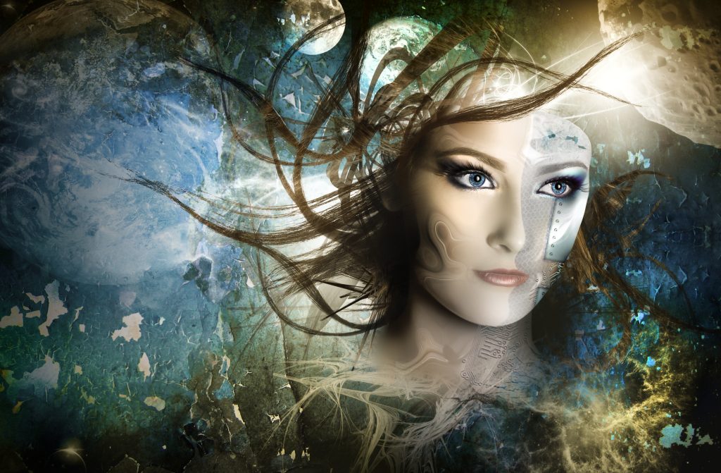
I also used an award-winning photographer and graphic artist who lives locally to me for this picture of Myra,
In the end, low sales meant that I couldn’t justify the expense of getting bespoke covers and artwork for every new release. That was sad but purely a business decision.
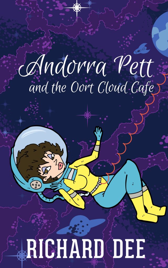
Which is really how I came to do my own covers. This is the first one that I did, exclusively with Canva, it actually cost me $1 for a license to use the image of the astronaut. The other images and the font were all free.
I’m still learning (obviously) but I think I’m getting better. My wife is a great help, a valuable sounding board and a source of some excellent ideas.
I design the cover at a very early stage of writing the book; when I only have a rough idea of what might happen. I find that doing so concentrates my mind and gives my writing a bit of a boost.
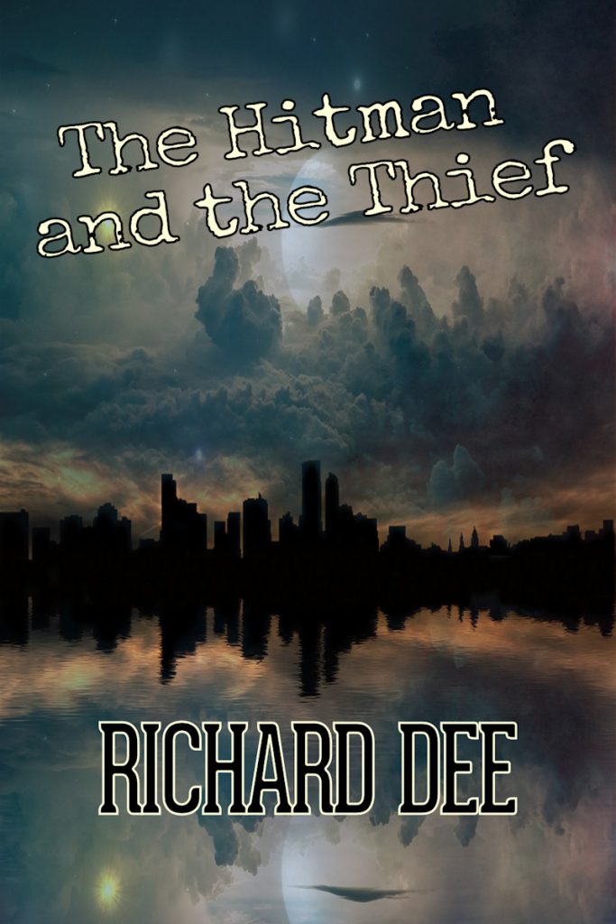
This is my cover for The Hitman and the Thief, it’s a sci-fi gangster noir story (which a bit of a genre mashup), so I went for the dark city look. The picture was free from Pixabay, the title font was also a freebie and I used the same author name style as I do everywhere.
Matching the cover design to the theme of the story and where possible, hinting at what you can expect is important, although I consider the main idea of the cover is to attract attention and produce something distinctive.
What’s required is an eye-catching picture that makes a potential customer stop scrolling and want (or better, feel the NEED) to investigate further.
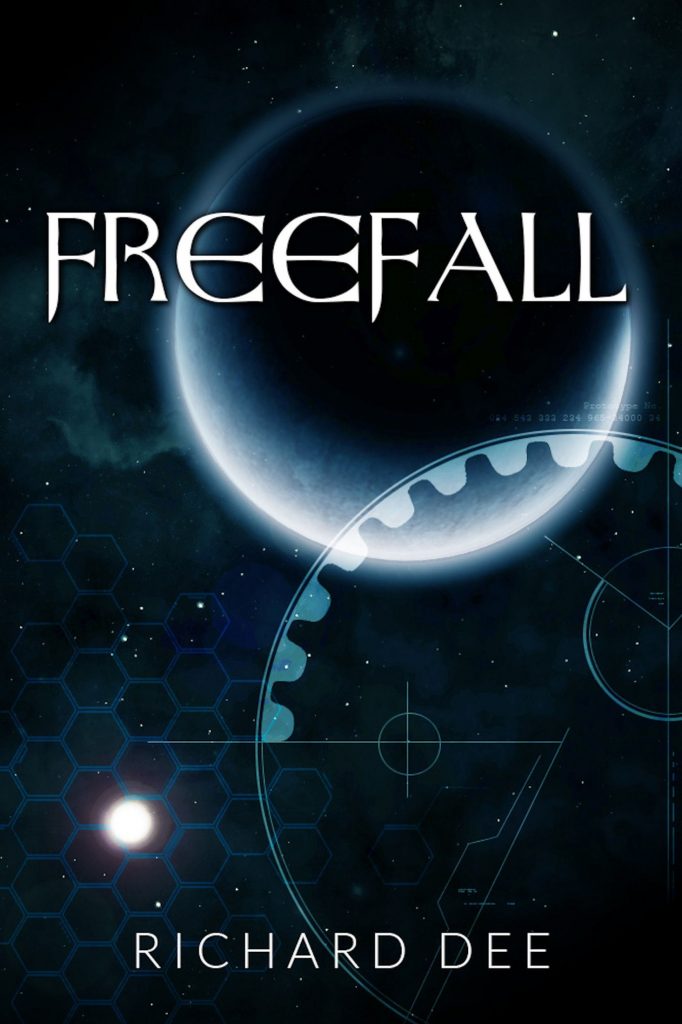
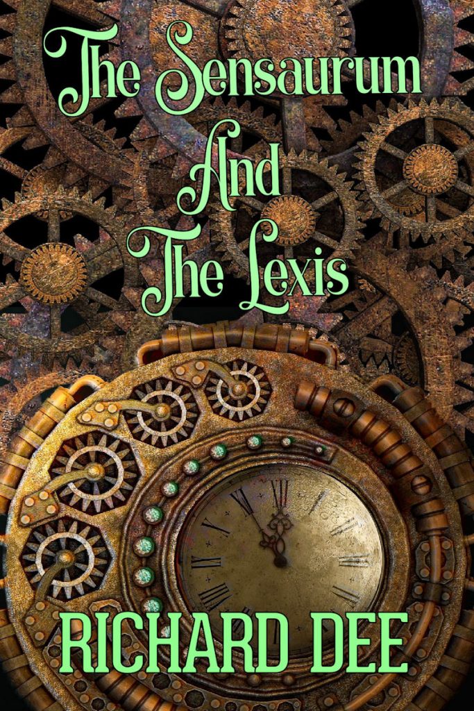
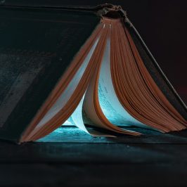
This is the cover of my latest, a Steampunk story and the first of a series,
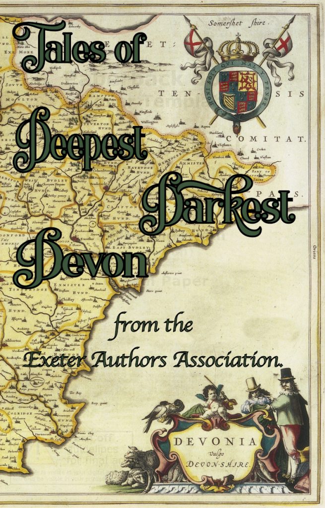
I must be doing something right, as I was asked to design the cover for my writing groups upcoming anthology.
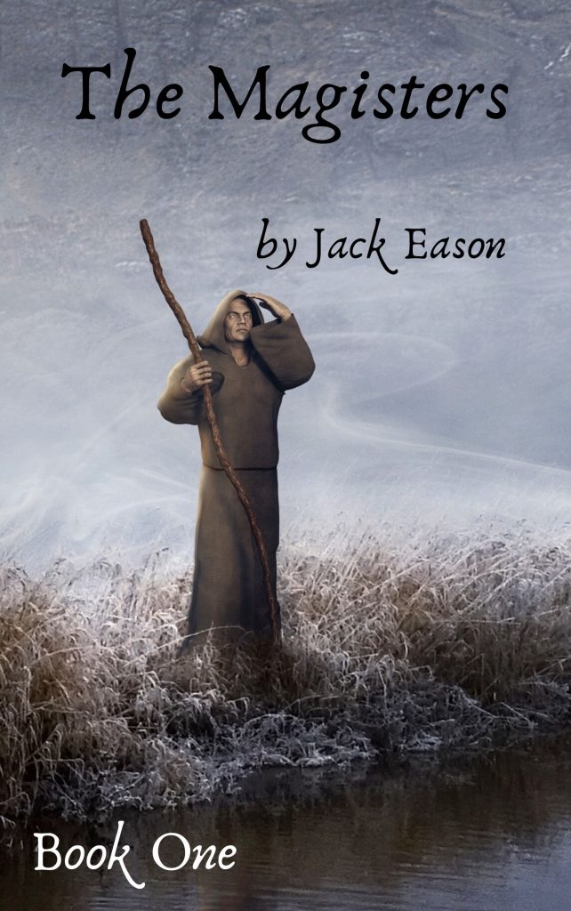
and a cover for a new Sci-fi story by a friend.
You can see all my book covers by going to my portfolio page.
What do you think about this week’s topic, are there covers you love or hate? If you design your own, how do you do it? Please let me know your thoughts in the comments, then make sure that you check out the rest of the great blogs on this hop.
Just follow this link.
https://fresh.inlinkz.com/p/3f3fef4af27149348daaa7873f0de69a
![]()
Jack Eason
You did a brilliant job for me mate.
Richard Dee
You’re very welcome, glad to help.
Stevie Turner
Well done for tackling covers yourself, Richard. You’re doing a grand job!
Richard Dee
Thanks, its quite a learning curve but as long as they catch the eye (for whatever reason), it’s job done.
Chris L Adams
Great topic there, Richard. I’m currently laying out the cover for my next one in line to publish. This one I painted in oils, then doing the text &Etc in GIMP. Masking is still tricky for me. It’s just an odd concept to grasp.
Richard Dee
Your artwork is brilliant Chris, it took me ages to grasp layers and masks, a lot of the time I just keep clicking until I get roughly what I want.
Chris L Adams
Thanks, Richard!
Layers were an easy part for me because I use them extensively in AutoCAD. But this masking, it’s still tricky. A lady asked me to restore an old photograph for her, and in researching how to do that (color faded to mostly B&W) I quickly learned that masks are the go-to tool of choice here. Still working on mastering them.
Richard Dee
I’m getting there slowly, learning each new technique as I need it. Thanks are due to Youtube.
Chris L Adams
Yes, YouTube is a real lifesaver from installing bearings in autos to creating your own custom vignette in GIMP. I recently watched these to learn that trick… Pretty darn cool….
https://youtu.be/V9CY3jkvpAI
https://youtu.be/zROOS1pTeqs
Richard Dee
It’s amazing what you can find there. Here’s one of me at work, showing you how to take a ship through Tower Bridge.
https://www.youtube.com/watch?v=2R3JgsJkhJc&t
P.J. MacLayne
I often use Pixabay for the images I use on my blog.
Richard Dee
The site is a great resource, even a writer of Sci-fi and Steampunk (like me) can find so many useful pictures.
phil huston
Good for you. When it’s on you a little of you gets in there, even if it’s clip art. And that’s a good thing because sometimes what we assemble from ready to wear comes out looking vastly different than the romance novel sweatshop covers. If it sets you off even a little, that’s great.
Richard Dee
Yes, it’s just another part of the whole that I’m involved and invested in. I’m pleased with my self-designed covers. Because they’re mine, they mean that little bit more.
Amy Miller
Your covers are great, and I agree with your advice. It’s best to play around with the free stuff and learn what you can before hoping into the expensive stuff before you know if that’s what you really want to do.
Richard Dee
Thank you, I loved my professional covers but I also love doing my own.