Welcome back to the second of my posts on marketing. This time, we’re looking at one of the most important things you can do to improve your visibility.
Branding is the art of establishing a connection between everything that you do online. It makes content instantly recognisable as yours, wherever it might appear. That’s important, as it identifies you and, as your following grows, will pull readers towards other work of yours that they recognise from the familiar elements.
The best bit, it’s free to do, all you need is to decide on a defining look. Something that will represent what you’re all about.
At its simplest, it can be a logo, or just the typeface that your name uses on all your book covers. But branding covers everything that you produce, right up to the consistency between all your social media graphics and common themes across platforms.
So, it’s important to consider it right from the start, or it will take a lot of work to sort it out later, as I can confirm by my own experience.
When I started, I thought that it would be enough to use a logo for my books and the same typeface for my name across all my covers.
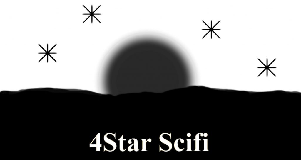
Here’s my original logo.
For headers on social media, I used a composite of my book covers. As I published more, the picture changed, to reflect my growing catalogue.
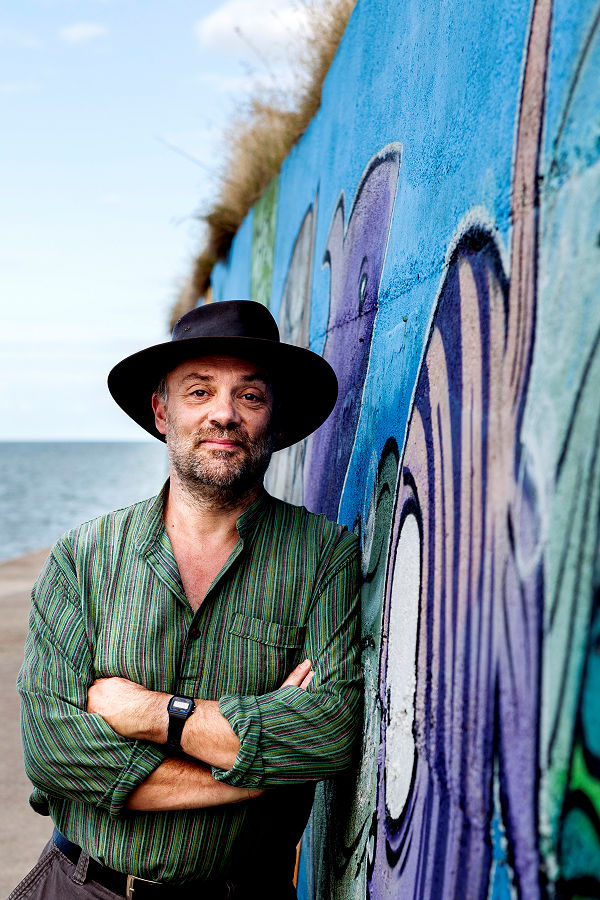
I did get a professional picture taken for my profile, largely because I wanted something that could be used in high quality applications, should I ever need them. I then made a standard quality version of it for day-to-day use.
I thought that everything was constant across my output. The thing was, I was only really doing half a job. There was no consistency in my cover art, nothing to suggest that the books were connected in any way.
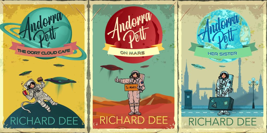
These were the original covers for books 1-3 of the Andorra Pett series.
As you can see, they were a real mash up. Only Andorra Pett and the typeface of my name linked them.
In an effort to improve sales, I asked around a few Facebook groups for suggestions. The overwhelming one was to change my covers. In response, my catalogue underwent a radical makeover. At that time, all my series were synchronised, so that each set of covers matched up. You can see them in the header graphic on the site.
I also had a new logo designed, as well as a few extra graphics.
Re-organising everything was a big job which would have been so much easier if I had planned it out from the start.
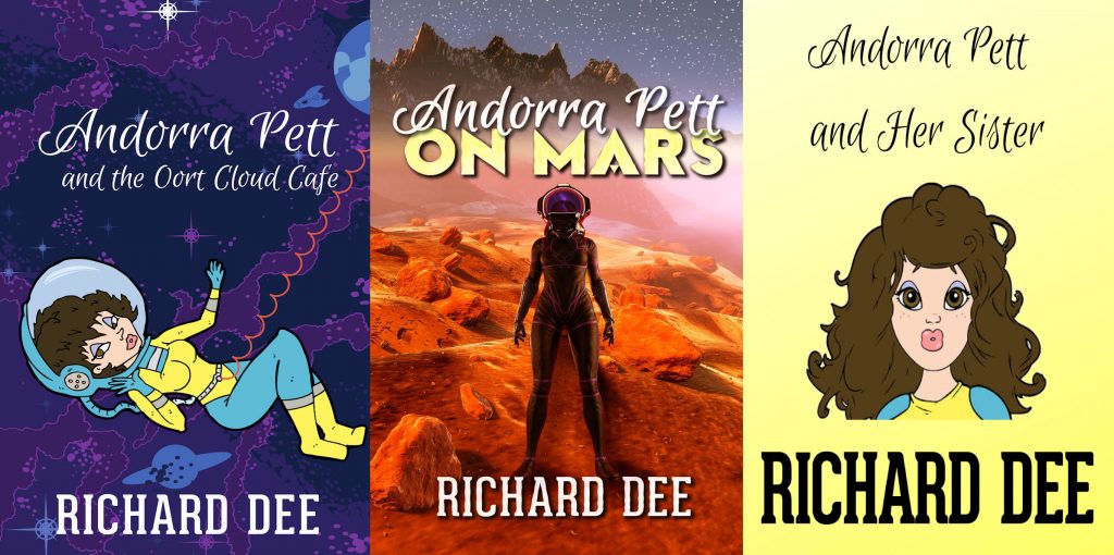
Now I have a base for everything to grow from. Look at the Andorra Pett series now.
Even if you have to re-work everything, there’s an important lesson you can take from a redesign. Nothing need ever be wasted.
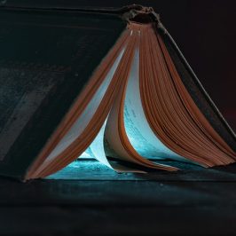
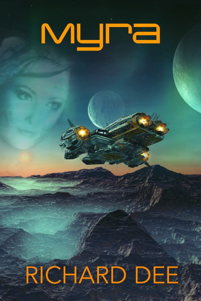
Here’s another example. First, the original cover for my space opera, Myra,
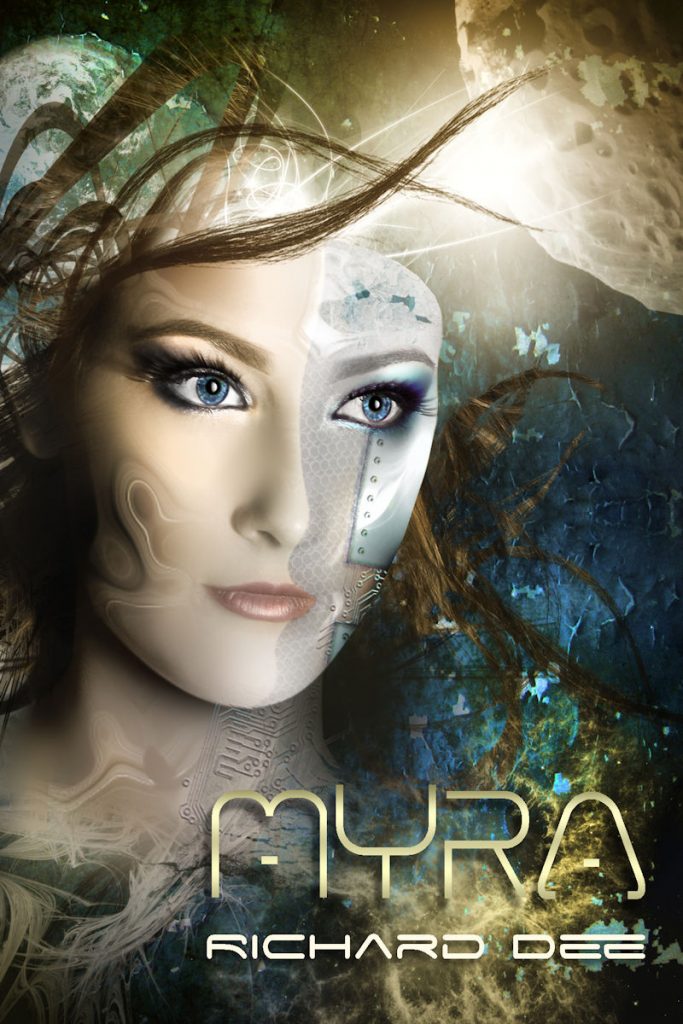
this is the full image, which was created for me by a very talented local artist.
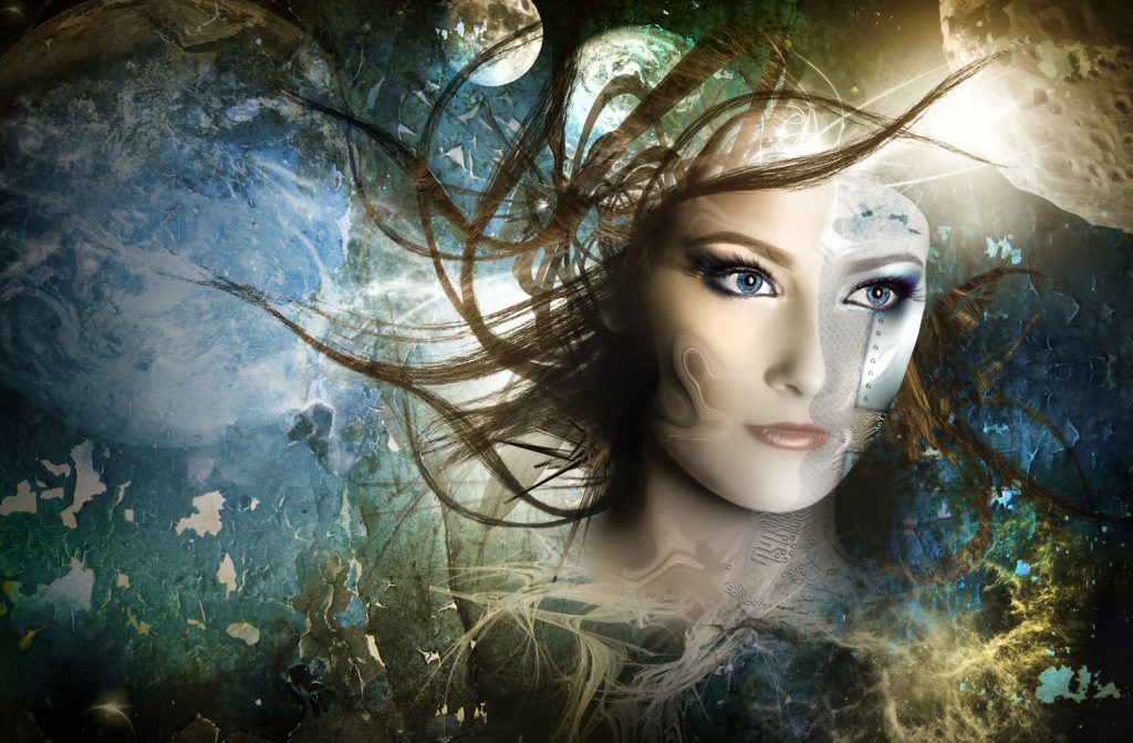
This is the new cover image. As you can see, I have managed to use part of the original Myra image in the new cover.
I’ll be talking about more uses for your graphics next time; when we move on and start to look at promotion.
In case you’re wondering; when we get there, I won’t be offering a practical course on how to advertise on various platforms. Largely because I’m not an expert, but I will tell you a few things that I’ve learned along the way.
I’d love to get your comments, please leave them below. While you’re here, why not take a look around? There are some freebies and lots more content, about me, my writing and everything else that I do. You can join my newsletter for a free novella and more news by clicking this link.
All my publications can be found on my Amazon page,
![]()